
REBRANDING
BRIGHTSIDE UP, A CHILD CARE REFERRAL NON-PROFIT AGENCY
-
The old name, the Capital District Child Care Coordinating Council was long, confusing and didn't accurately represent who the agency was. It lacked the softness and playfulness that they needed. They narrowed their focus while keeping their values fully intact. Brightside Up: It means forward thinking. It means focusing on children's strengths. It means not viewing "failures" as things to be ashamed of or avoided, but as mere opportunities for growth and learning; a lens through which we can strive to be better parents, providers, educators and children. Brightside Up became the new name, indicative of their generous and playful spirit.
-
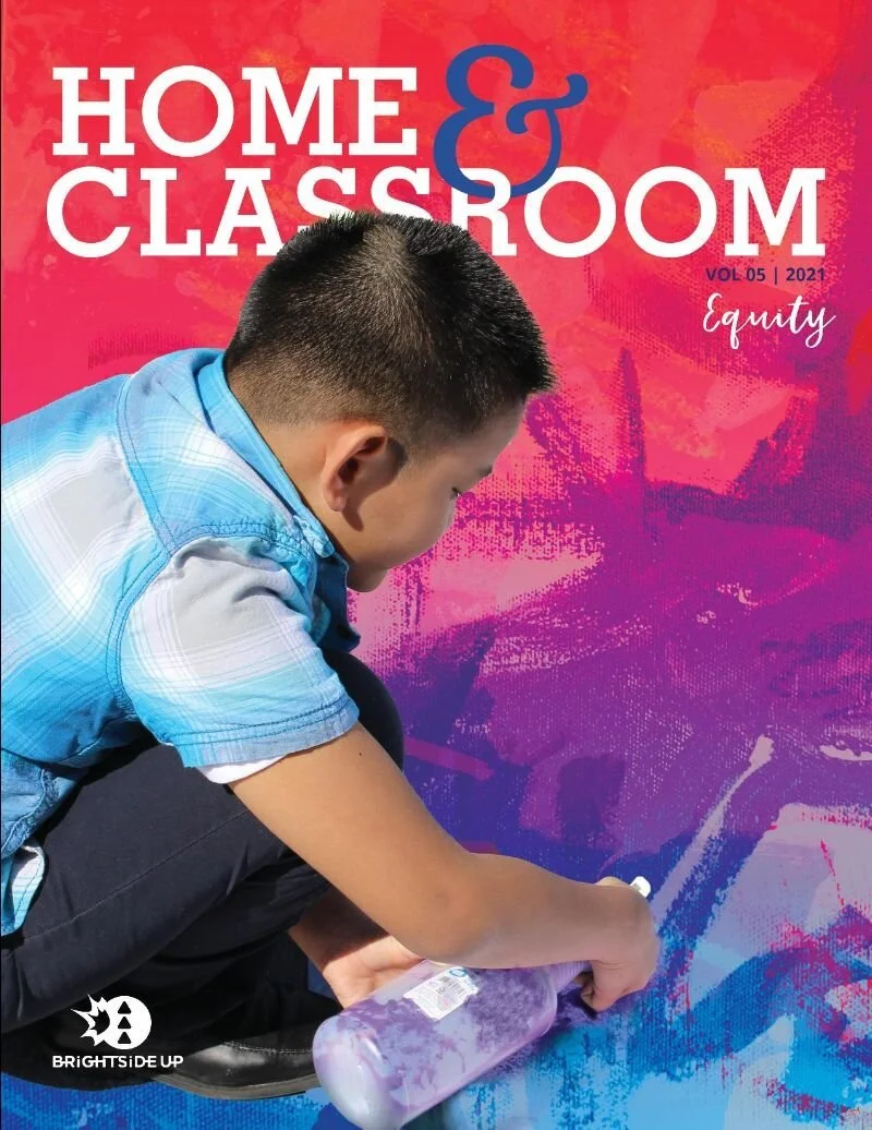
Use children’s artwork as graphic elements, backgrounds, and a way to communicate with the world; children’s art is a universal language, demonstrating the developmental stage of a particular drawing or painting. Also have each employee submit children’s artwork from their own lives to use on their business cards.
Capture real moments in the child care programs for photgraphy and video library.
Bright, bold, dynamic, professional
-
Description text goes here
LOGO
The new logo is light-hearted, playful and designed to stress the collaborative spirit and forward thinking of the community of child care providers and educators. BSU’s brand identity is dynamic and fluid by design; meant for use across multiple platforms yet recognizable whether you see the burst icon standing alone for social media or deconstructed and interweaved with the agency name as a combination mark.